Building reusable components for Webex’s Design System, cutting handoff time between designers and developers by 50%.
Product Momentum Design System
Momentum is the design system powering Webex’s collaboration products from App, Meetings and Messaging to admins tools like Control Hub, Contact Center and Partner Hub.
Problem Scalability Struggles
Fragmented Figma files and static, unstandardized assets created mounting design debt for the Momentum team, forcing feature teams to build custom UI variations and delaying engineering delivery.
Solution Modular components
I led the redesign of 5+ core Momentum components into flexible, code-aligned components, supporting global design token updates, streamlining library maintenance and enabling product teams to ship features faster.
Result Scalable design system
Unified 150+ designers across 17+ Webex product teams by leading the atomic refactor of several core component families while supporting global library tokens and updates—reducing local component overrides by 60%
Details
Role/Team: Product Designer working with 3 product designers
Contributions: Component Architecture, User Research, UX Design, Rapid Prototyping, Auditing, Engineering Handoff
Tools: Figma, Jira, Confluence, Webex
Timeline: 2022-2023
Scope: Enterprise SaaS, Design Systems, Internal Tools, Atomic Design, UI/UX Design, UI Tokens and Components
Impact
150+
designers supported
across Cisco product ecosystem
+60%
system conformance
Less custom components, more cohesion
Modularity
built into system
Atomic architecture simplifies system maintenance with scalable component architecture.
Powering 17+ product teams, Momentum maintains visual and functional consistency from Webex Calling, Messaging, and App to Control Hub, Contact Center, and Devices.
Momentum is the design system used across Webex to deliver a cohesive brand experience.
Context
Fragmented Figma Libraries: Outdated, unstandardized assets across teams led to mounting design debt that throttled release cycles and delayed feature rollouts.
Rigid Legacy Components: Static, non-flexible assets forced designers to repeatedly detach components to meet complex feature specifications.
Design-Engineering Friction: A lack of centralized component logic created misalignment between Figma variants and production code, slowing down handoffs.
As Webex scaled, UI fragmentation and engineering silos stalled product velocity.
Problem
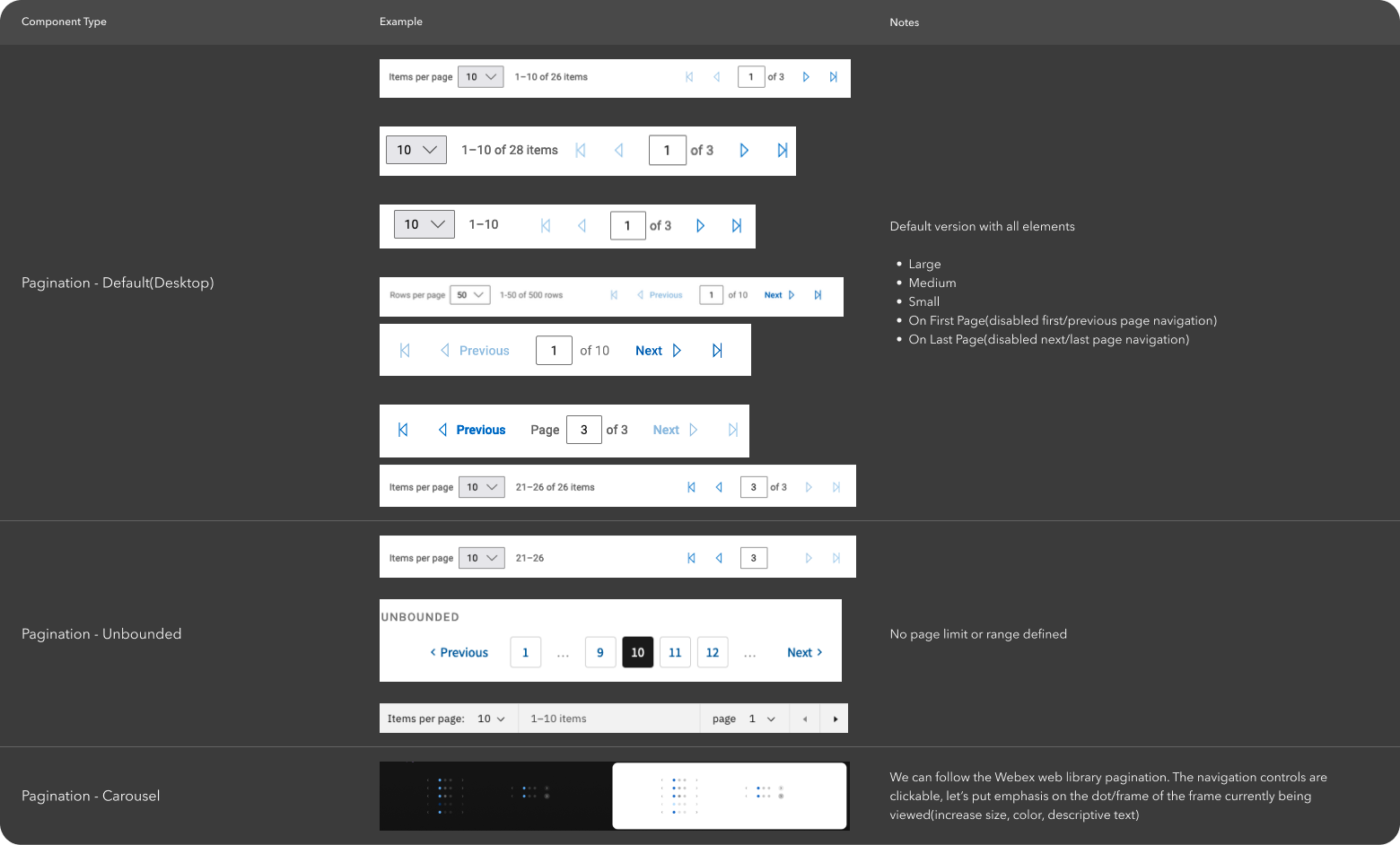
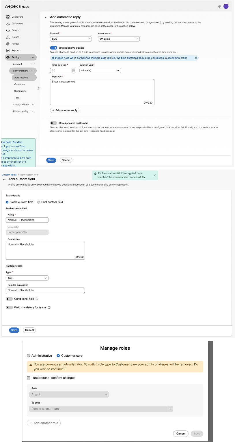
Internal audit of Webex Admin tools revealed multiple custom styles (e.g. Progress Bars, Pagination, and Banners) not supported by the current Momentum library.During my tenure on the Momentum team, my primary focus was refactoring high-friction component families—Banner, Pagination, and Progress Bar—while supporting broader library token updates across Webex Admin.
Targeted Component Overhaul: Transition static, legacy UI assets for Banner, Pagination, and Progress Bar into dynamic, token-driven components using modern Figma features (Auto layout, variants, component properties).
Global Token Support: Update foundational design tokens (color styles, spacing) to ensure consistency across the wider component ecosystem.
Code-Design Alignment: Work directly with engineering to mirror production props and states in Figma, eliminating handoff friction for feature teams.
Rebuilding Momentum components for flexibility, parity, and scale.
Goal + North Star
Key Insight 1: Variant Flexibility vs. Constraint: Top systems like IBM Carbon and Adobe Spectrum provided flexible variant properties while maintaining strict tokenized boundaries to prevent component detaching.
Key Insight 2: Built-in Accessibility: Mature design systems included accessibility notes, focus states, and screen-reader guidelines directly within component documentation rather than treating them as afterthoughts.
Key Insight 3: Comprehensive documentation: Designers are able to spend less time figuring out how to use the component, and more time building products and features with our design system.
I conducted competitive analysis and contextual inquiries of Webex Admin products with designers to audit internal friction and target the root causes of system drift.
Process + Key Insights
Competitive analysis of industry design systems (e.g., progress bars across Adobe, Material, Carbon) to establish criteria for component flexibility and documentation standards.Atoms: Established the foundational design tokens— typography, spacing, color.
Molecules: Assembled atoms into functional primitives like buttons, inputs, and tooltips for consistent interaction patterns.
Organisms: Combined atoms and molecules to architect complex, reusable UI patterns such as navigation bars and data tables.
Leveraging Atomic Design principles ensures component modularity, maintainable logic, and structural consistency across the components.
Solution
Atomic breakdown of the Progress Bar component.Documentation proactively assists designers with support and defines a shared language when working cross-functionally with stakeholders.Targeted Component Overhaul: Delivered robust, scalable Banner, Pagination, and Progress Bar component families, establishing flexible variant sets that increased customization for feature teams while simplifying system maintenance.
Enhanced System Conformance: Reduced local component overrides and detaches by 60% by replacing static legacy layers with interactive, tokenized properties.
Synchronized Figma properties: With production code to streamline handoffs, eliminating implementation bugs and ensuring more predictable release cycles.
Eliminating design debt through modular, scalable, high-frequency components.
Results
Intentionality at Scale: Intentionality with every design decision ensures every component serves as a reliable building block for the entire ecosystem. In a system of this scale, small errors cascade into systemic debt — precision at the atomic level is non-negotiable.
Bridge the Vocabulary Gap: Aligning component naming conventions with designers and engineers early on is critical to avoid "lost in translation" moments during handoff.
Proactive Stakeholder Alignment: Large-scale system changes require consistent, proactive effort to maintain alignment. I prioritized continuous syncs with stakeholders to ensure our component logic remained functional across every product vertical.